色彩是網頁設計中最強大的視覺元素之一。研究顯示,90% 的第一印象來自於色彩,而且用戶只需 0.05 秒就能對網站形成初步判斷。Color is one of the most powerful visual elements in web design. Research shows that 90% of first impressions come from color, and users form initial judgments about a website in just 0.05 seconds.
📊 色彩對用戶行為的影響📊 Impact of Color on User Behavior
品牌識別度提升 80%:一致的配色能讓品牌更容易被記住80% increase in brand recognition: Consistent color schemes make brands more memorable
轉化率提升 24%:正確的按鈕顏色能顯著提高點擊率24% increase in conversion rates: The right button color significantly improves click-through rates
閱讀理解提升 73%:適當的對比度讓內容更易閱讀73% improvement in reading comprehension: Proper contrast makes content easier to read
情緒影響力:不同顏色能引發特定的情感反應Emotional impact: Different colors trigger specific emotional responses
優秀的配色方案能夠:A great color scheme can:
建立品牌形象:傳達企業價值觀和個性Establish brand identity: Communicate company values and personality
引導用戶行為:吸引注意力到重要元素Guide user behavior: Draw attention to important elements
提升用戶體驗:創造舒適的視覺環境Enhance user experience: Create a comfortable visual environment
增強可讀性:確保內容清晰易讀Improve readability: Ensure content is clear and easy to read
無障礙友善:讓所有用戶都能使用網站Support accessibility: Make the site usable for all users
實際網頁配色案例展示
🌈 色彩基礎理論🌈 Color Theory Basics
色彩三要素Three Elements of Color
理解色彩的三個基本屬性是掌握配色的關鍵:Understanding the three basic properties of color is key to mastering color matching:
1️⃣ 色相(Hue)1️⃣ Hue
定義:顏色的基本屬性,即「什麼顏色」(紅、橙、黃、綠、藍、紫)Definition: The basic property of color, i.e., "what color" (red, orange, yellow, green, blue, purple)
在色輪上以 0-360 度表示Represented as 0-360 degrees on the color wheel
高飽和度顏色充滿活力,低飽和度顯得柔和High saturation colors are vibrant, low saturation appears softer
💡 應用:主色用高飽和度吸引注意,背景用低飽和度避免疲勞💡 Application: Use high saturation for primary colors to attract attention, low saturation for backgrounds to avoid fatigue
最常用於網頁設計的顏色格式,簡潔且廣泛支援。The most commonly used color format in web design, concise and widely supported.
格式說明Format Explanation
#RRGGBB
#FF5733
  ││││││
  │││││└─ 藍色值(00-FF)Blue value (00-FF)
  ││││└── 藍色值(0-15)Blue value (0-15)
  │││└─── 綠色值(00-FF)Green value (00-FF)
  ││└──── 綠色值(0-15)Green value (0-15)
  │└───── 紅色值(00-FF)Red value (00-FF)
  └────── 紅色值(0-15)Red value (0-15)
#000000 = 黑色(所有通道為 0)#000000 = Black (all channels at 0)
#FFFFFF = 白色(所有通道為最大值)#FFFFFF = White (all channels at max)
#FF0000 = 純紅色#FF0000 = Pure red
#00FF00 = 純綠色#00FF00 = Pure green
#0000FF = 純藍色#0000FF = Pure blue
💡 簡寫:如果兩兩相同可簡寫,如 #FFFFFF → #FFF💡 Shorthand: Can be shortened if pairs are the same, e.g., #FFFFFF → #FFF
2️⃣ RGB(紅綠藍)2️⃣ RGB (Red Green Blue)
基於光的三原色,直觀且易於理解。Based on the three primary colors of light, intuitive and easy to understand.
技巧:選一個主色,其他作為輔助Tip: Choose one dominant color, others as support
♿ 無障礙設計原則♿ Accessibility Design Principles
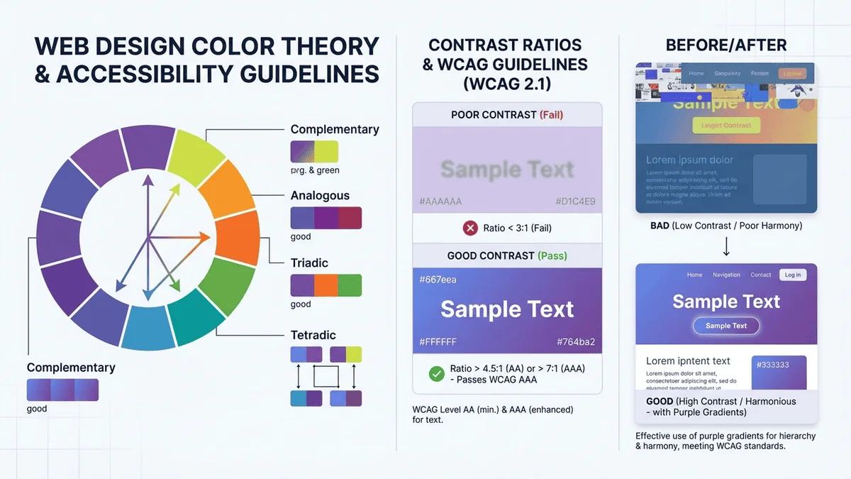
根據 WCAG(Web Content Accessibility Guidelines),網站必須確保所有人都能使用,包括視力障礙者。According to WCAG (Web Content Accessibility Guidelines), websites must ensure accessibility for all users, including those with visual impairments.
對比度要求Contrast Requirements
文字類型Text Type
AA 級(最低)AA Level (Minimum)
AAA 級(增強)AAA Level (Enhanced)
正常文字Normal text
4.5:1
7:1
大文字(18pt+ 或 14pt+ 粗體)Large text (18pt+ or 14pt+ bold)
3:1
4.5:1
圖形和 UI 元件Graphics and UI components
3:1
-
✅ 合格範例✅ Passing Examples
深灰文字 + 白色背景Dark gray text + white background 對比度:12.6:1(AAA級)Contrast: 12.6:1 (AAA level)
白色文字 + 藍色背景White text + blue background 對比度:8.6:1(AAA級)Contrast: 8.6:1 (AAA level)
❌ 不合格範例❌ Failing Examples
淺灰文字 + 白色背景Light gray text + white background 對比度:1.6:1(不合格)Contrast: 1.6:1 (Fails)
淺藍文字 + 藍色背景Light blue text + blue background 對比度:2.1:1(不合格)Contrast: 2.1:1 (Fails)
色盲友善設計Color Blind Friendly Design
色盲類型與影響Types of Color Blindness & Impact
紅綠色盲:最常見(男性 8%,女性 0.5%),難以區分紅色和綠色Red-green color blindness: Most common (8% males, 0.5% females), difficulty distinguishing red and green
藍黃色盲:較少見,難以區分藍色和黃色Blue-yellow color blindness: Less common, difficulty distinguishing blue and yellow
全色盲:極少見,只能看到灰階Total color blindness: Very rare, can only see grayscale
💡 色盲友善設計技巧💡 Color Blind Friendly Design Tips
不要只依賴顏色:使用圖示、文字、圖案等輔助
例如:❌ 只用紅綠表示錯誤/正確
✅ 使用紅色 + ✘ 圖示 / 綠色 + ✔ 圖示Don't rely on color alone: Use icons, text, patterns as aids
Example: ❌ Using only red/green for error/success
✅ Using red + ✘ icon / green + ✔ icon
使用高對比度:確保即使顏色無法區分,明暗仍可辨識Use high contrast: Ensure light/dark differences remain distinguishable even without color
避免問題組合:Avoid problematic combinations:
紅色 + 綠色Red + Green
藍色 + 紫色Blue + Purple
綠色 + 棕色Green + Brown
使用色盲模擬工具:測試設計在色盲視角下的效果Use color blindness simulators: Test your design from a color blind perspective
支援 HEX、RGB、HSL、CMYK 格式轉換,視覺化色輪選色,即時預覽效果。100% 本地處理,保護隱私,無需註冊,完全免費。Supports HEX, RGB, HSL, CMYK format conversion, visual color wheel, live preview. 100% local processing, privacy protected, no registration, completely free.
Behance - Adobe 設計社群Behance - Adobe design community
Awwwards - 優秀網頁設計獎Awwwards - Outstanding web design awards
✨ 總結✨ Summary
網頁配色是一門藝術,也是一門科學。通過本文,你已經掌握了:Web color design is both an art and a science. Through this article, you've learned:
✅ 色彩理論三要素(色相、飽和度、明度)✅ Three elements of color theory (hue, saturation, lightness)
✅ 四種顏色代碼格式(HEX、RGB、HSL、CMYK)✅ Four color code formats (HEX, RGB, HSL, CMYK)
✅ 六種經典配色方案(單色、類似、互補等)✅ Six classic color schemes (monochromatic, analogous, complementary, etc.)
✅ 無障礙設計原則(對比度、色盲友善)✅ Accessibility principles (contrast, color blind friendly)
✅ 實際配色案例與技巧✅ Practical examples and tips
記住,好的配色方案需要時間和練習。多觀察優秀作品,多做實驗,逐漸培養自己的色彩感覺。需要快速選擇和轉換顏色時,別忘了使用我們的線上顏色選擇器!Remember, good color schemes take time and practice. Study great designs, experiment, and gradually develop your color sense. When you need to quickly pick and convert colors, don't forget our online color picker!
🚀 開始使用顏色選擇器🚀 Start Using Color Picker
支援多種顏色格式轉換,視覺化選色,即時預覽,100% 本地處理,完全免費Supports multiple color format conversion, visual picking, live preview, 100% local processing, completely free